

Here's the fastest way to understand how any article is performing: check three things in this order. First, read the quick metrics: sessions, average engagement time, and conversions. Second, match the article to its job (does it exist to get found, teach something, or drive a sale?) and pick one or two KPIs that fit that job. Third, choose an action based on what those numbers show: promote it, optimize it, update it, or archive it.
You'll spot trouble fast if you know what to look for. High sessions paired with low engagement time usually means the title or meta description overpromises and the content underdelivers. A steady decline in impressions over 60 to 90 days often signals the page is losing relevance or getting outranked. And conversions that flatline while traffic climbs tells you the content is attracting the wrong audience.
The rest of this guide walks through:
- Which metrics actually matter, and which ones just look good in a screenshot
- How to pull the right reports from GA4 without drowning in tabs
- A simple audit method (Evergreen, Refresh, Decay, Archive) to turn numbers into a to-do list
Key Takeaways
Understanding article performance data means mapping each metric to a specific content job, normalizing by traffic volume, and sorting results into a clear action bucket rather than reading numbers in isolation.
| Point | Details |
|---|---|
| Read three metric types | Check reach, engagement, and conversion together, since any one alone can mislead. |
| Match KPIs to the article's job | Pick one or two KPIs based on whether the article discovers, educates, converts, or retains readers. |
| Normalize before comparing | Use rates per 1,000 sessions and a 90-day rolling average instead of raw counts. |
| Sort into four buckets | Classify each article as Evergreen, Refresh, Decay, or Archive, then act on the highest-leverage bucket first. |
| Validate before acting | Confirm a metric shift isn't a tracking error or a one-off traffic spike before you rewrite anything. |
Table of Contents
- How to Understand Article Performance Data by Metric Type
- How Do You Match Metrics to an Article's Job?
- Which GA4 Reports Should You Check for Article-Level Data?
- How Do You Normalize and Benchmark Article Data Fairly?
- The Four-Bucket Audit: Evergreen, Refresh, Decay, or Archive
- What Tracking Problems Can Mislead Your Analysis?
- How to Segment Article Performance Data by Audience
- How to Spot and Interpret a Sudden Change in Article Metrics
- Why Qualitative Feedback Belongs Next to Your Metrics
- How Do You Test Whether a Content Change Actually Worked?
- Seeing This Workflow Inside an Editor
- What Practitioners Get Wrong About Article Analytics
- Sources
- FAQ
How to Understand Article Performance Data by Metric Type
Every article throws off dozens of numbers, but only three categories actually matter: reach, engagement, and conversion. Understanding content performance starts with knowing which bucket a metric belongs to and what it's actually telling you — this is explained in detail in What Is AI-Generated Content and Its SEO Impact.
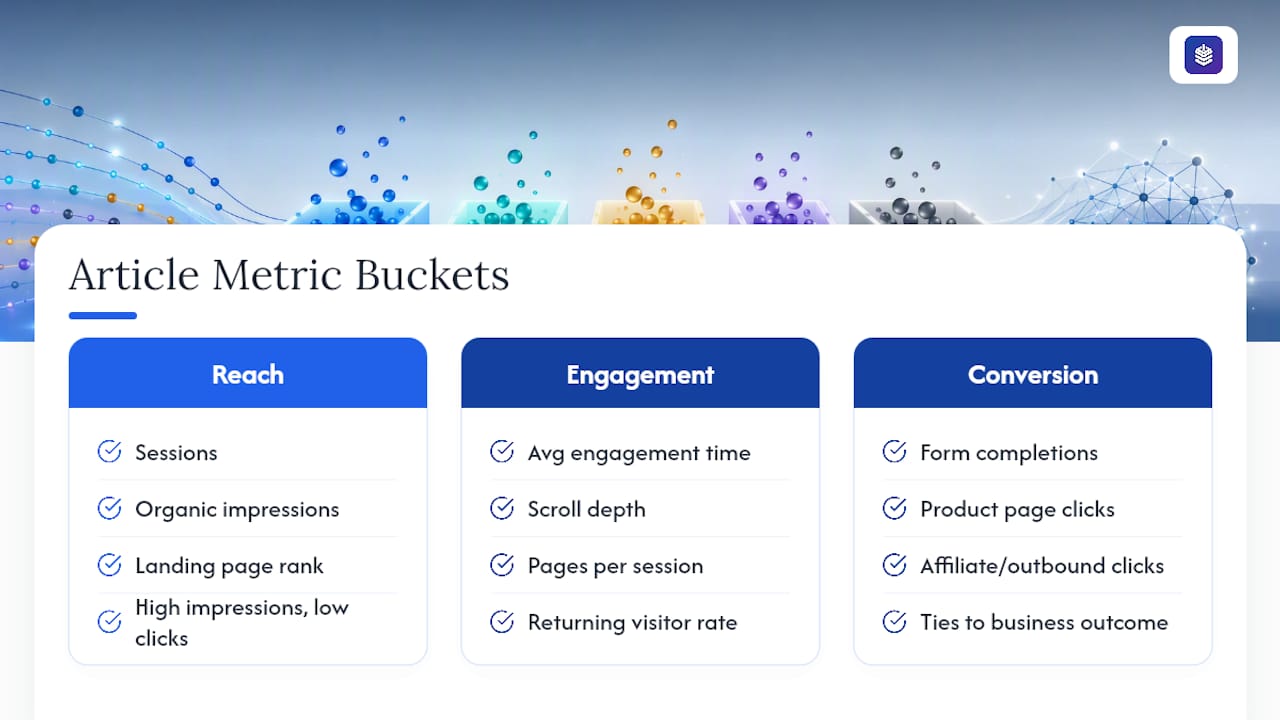
Reach metrics answer one question: did people find this article? Sessions, organic impressions, and landing page ranking for target keywords all fall here. A spike in impressions with flat clicks usually means the article is showing up in search but the title or snippet isn't earning the click.
Engagement metrics tell you whether the people who arrived actually stuck around and read. Average engagement time, scroll depth, pages per session, and returning visitor rate are the core four. An article averaging under 30 seconds of engagement time is getting skimmed, not read, regardless of how many sessions it pulls in.
Conversion metrics connect the article to a business outcome: form completions, product page clicks, affiliate or outbound link clicks. This is where article engagement analysis earns its keep, because traffic without conversion is just noise with a nice chart.
Quick gut check: A page with 5,000 sessions and 12 conversions (0.24%) is often healthier than one with 500 sessions and 8 conversions (1.6%) in absolute terms, but the second page is doing more per visitor. Rate and volume tell different stories, which is why combining engagement metrics with monetization signals matters more than watching either number alone.
Sessions and pageviews are the easiest numbers to screenshot for a report, and the easiest to misread. A big traffic number with no engagement or conversion backing it up is a vanity metric. The moment reach starts moving a KPI further down the funnel, it becomes a real signal.
How Do You Match Metrics to an Article's Job?
Not every article should be judged the same way. A framework built around the article's actual job prevents you from grading a top-of-funnel blog post on conversion rate, or an evaluate article effectiveness for a bottom-of-funnel guide by traffic volume alone.
Most articles serve one of four jobs:
- Discover — get found in search and pull in new visitors who don't know the brand yet.
- Educate — build trust and understanding around a topic, product category, or problem.
- Convert — move a reader toward a purchase, signup, or demo request.
- Retain — give existing customers a reason to come back and stay engaged.
Once you know the job, pick one or two primary KPIs and a guardrail metric to make sure you're not optimizing one number at the expense of another. A discover article's primary KPI might be organic sessions, guardrailed by engagement time (so you're not just attracting bounce traffic). An educate article's primary KPI might be engaged sessions plus scroll depth, guardrailed by return visits.
This is the same logic behind the Content Marketing Institute's full-funnel measurement framework, which maps content to a specific job in the funnel and tracks a small number of KPIs per job instead of every metric available.
Pro Tip: When you report results to stakeholders who don't live in analytics dashboards, translate the KPI into business language. "Engaged sessions" becomes "pipeline influenced." "Form completions from organic" becomes "content-driven signups." The number doesn't change, but the sentence gets read.
Which GA4 Reports Should You Check for Article-Level Data?
GA4 buries a lot of useful data behind default reports built for site-wide analysis, not single-article diagnosis. Here's how to pull exactly what you need.
- Open Reports > Engagement > Pages and screens, then filter by the specific article URL. This isolates the page from your site-wide averages.
- Add a secondary dimension for Session default channel group to split organic, social, and direct traffic. An article that reads as strong overall can be hiding a weak organic showing propped up by a social spike.
- Check Average engagement time and Engaged sessions for that URL. These GA4 engagement reports are more reliable than raw pageviews because they're event-based, not just a page-load count.
- Look at scroll events and video plays if you have enhanced measurement turned on. A reader who scrolls past 75% of the article is a much stronger signal than one who bounces after the intro.
- Mark relevant events as conversions (newsletter signup, add to cart, demo request) inside GA4's Admin panel, then check the Conversions report filtered to that landing page.
A few extra things worth checking while you're in there:
- Multi-touch or assisted-conversion reports, since an article that never gets last-touch credit can still be doing real work earlier in the funnel.
- Traffic source breakdown, because an article ranking well organically behaves very differently from one relying on a newsletter blast.
- Trend over the trailing 90 days, not just the current month, to separate a real shift from normal week-to-week noise.
If you're running this check monthly, build a simple Looker Studio dashboard or a saved GA4 exploration with these cards already configured. Rebuilding the same filtered view by hand every month is the single biggest reason audits get skipped.
How Do You Normalize and Benchmark Article Data Fairly?
Raw numbers lie by omission. An article with 40 conversions looks impressive until you learn it needed 40,000 sessions to get there, a 0.1% rate that a smaller, better-targeted post might beat by 10x.
Normalizing by traffic volume fixes this. Instead of comparing raw counts, calculate conversions per 1,000 sessions or engagement time as a rate rather than a total. This single adjustment, recommended in most content benchmarking guides, is what separates a real prioritization method from a gut-feel ranking.
Low-traffic pages need a different rule entirely. A page with fewer than 100 sessions in a month can swing from a 2% conversion rate to a 6% rate based on two or three form fills, an artifact of small sample size, not a real trend. Treat anything under that rough threshold as directional only until it accumulates more volume.
- Set a 90-day rolling average as your baseline instead of comparing month to month.
- Benchmark against your own site's median and 75th percentile article, not an industry-wide number that may not reflect your audience.
- Flag anything below the 25th percentile in engagement time for review, regardless of its traffic volume.
| Normalization Method | When to Use It |
|---|---|
| Conversions per 1,000 sessions | Comparing articles with very different traffic volumes |
| 90-day rolling average | Smoothing out weekly noise and seasonal spikes |
| Percentile ranking (median, 75th) | Benchmarking one article against your own site's typical performance |
A basic spreadsheet with a formula column for "conversions ÷ sessions × 1000" and a rolling average column will get you 90% of the way there without needing a dedicated analytics tool.
The Four-Bucket Audit: Evergreen, Refresh, Decay, or Archive
Once you've normalized the numbers, sort every article into one of four buckets based on traffic trend, engagement, and conversion signal over time.
- Evergreen — steady or growing traffic, solid engagement, consistent conversions. Action: promote it further through internal links, social resurfacing, or paid amplification.
- Refresh — decent traffic but engagement or conversion has gone soft. Action: optimize the title, meta description, structure, or CTA placement without a full rewrite.
- Decay — traffic and engagement both trending down over 90 days. Action: update the content with new examples, current data, and a restructured outline, then republish with a new date.
- Archive — traffic has bottomed out and the topic no longer serves a real search intent. Action: merge it into a stronger related post or redirect it, rather than letting it sit as dead weight.
This four-bucket method is standard practice in content benchmarking and prioritization guides, and it works because it forces a decision instead of just a diagnosis.
Pro Tip: Score each candidate on a rough impact-versus-effort scale before you touch anything. Knock out the quick wins first, then schedule the bigger rewrites.
What Tracking Problems Can Mislead Your Analysis?
Bad data looks exactly like a real trend until you dig in, which is why validating the numbers matters as much as reading them.

The usual culprits: missing or inconsistent UTM tags that scatter one campaign's traffic across five different source labels, events that misfire and undercount conversions, sampled data in high-traffic properties, and cross-domain tracking gaps when a reader clicks through to a separate checkout domain. Consistent UTM discipline and verified event tagging fix most of this before it becomes a problem.
Privacy shifts compound the issue. Cookie deprecation, Apple's App Tracking Transparency, and the move toward server-side tagging all mean fewer sessions get attributed cleanly, especially on mobile Safari traffic.
Before trusting a sudden shift, run a tagged test click, check the event log in GA4's DebugView, and cross-reference a sample of leads against CRM records. If the signal holds up after that, it's real. If you need to prove causation rather than correlation, that's when an A/B test earns its cost.
How to Segment Article Performance Data by Audience
A single blended number for an article hides more than it reveals, because different audience segments almost never behave the same way on the same page.

Start with GA4's demographic and interest reports, layered under the same landing page filter you used for the top-level metrics. New versus returning visitors is the most useful split for most articles: a high share of new visitors with low engagement time often means the piece is ranking for a broad, low-intent keyword, while strong engagement among returning visitors suggests it's doing real retention work.
Device category matters more than most marketers assume. An article with strong desktop engagement but a steep mobile drop-off usually has a formatting problem, long paragraphs, a slow-loading image, a CTA buried below three scrolls, not a content problem. Check average engagement time split by device before assuming the whole article underperforms.
Geography and language can also skew a blended average. A post ranking for a keyword with meaningfully different intent in two countries will show conversion rates that look inconsistent until you split them out.
Behavioral segments add another layer worth checking: sessions arriving from a specific referral source, sessions triggered by an email campaign, or sessions that hit a specific scroll depth before leaving. Building a saved GA4 segment for "engaged sessions from organic search, first-time visitors" gives you a much cleaner read on true discover-stage performance than the site-wide default view ever will.
How to Spot and Interpret a Sudden Change in Article Metrics
A sharp jump or drop in an article's numbers is either a real signal or a data artifact, and mistaking one for the other wastes time in both directions.
Start by checking the calendar. A traffic spike that lines up with a newsletter send, a Reddit thread, or a seasonal search pattern (a "best gifts" article every November) explains itself. A drop that lines up with a Google core update, a site migration, or a change in internal linking structure also explains itself.
If timing doesn't explain it, check the traffic source breakdown first. A spike concentrated in one channel, say, referral traffic from a single domain, points to an external event rather than a genuine shift in search performance. A broad-based decline across organic, direct, and referral traffic simultaneously usually means something changed on your site: a redirect, a removed internal link, or a technical error blocking crawlers.
Rule out tracking issues next. A metric that drops to exactly zero overnight is almost never a real behavioral shift. It's a broken tag, a consent banner blocking analytics, or a deployment that stripped the tracking script.
Once you've ruled out timing, source concentration, and tracking failure, treat the change as real and act on it. A genuine decay signal that survives this checklist belongs in the Refresh or Decay bucket from the audit method above, not in a "wait and see" folder that never gets revisited.
Why Qualitative Feedback Belongs Next to Your Metrics
Numbers tell you what happened. Comments, shares, and direct reader feedback often tell you why, and skipping that half of the picture means you're optimizing blind.
Blog comments and social replies surface the specific sentence that confused someone, the example a reader wanted but didn't get, or the objection nobody addressed. A pattern of three or four comments asking "but what about X" is a stronger content brief than any keyword tool will give you. Social shares carry a different signal: a post that gets shared heavily but converts poorly is probably resonating on a topic or emotional level without matching the searcher's actual intent, a mismatch pure analytics won't show you on its own.
Customer support tickets and sales call notes are an underused source here too. If a support team keeps fielding the same question that one of your articles is supposed to already answer, that's a signal the content isn't landing, even if the engagement time metric looks fine.
The practical move is to log qualitative notes next to the quantitative dashboard during your monthly review, not as a separate exercise. When a Decay-bucketed article also has a string of confused comments, that's confirmation, not coincidence, and it tells you exactly what the update needs to fix rather than just that it needs one.
How Do You Test Whether a Content Change Actually Worked?
Every optimization is a hypothesis until you measure what happened after you shipped it, and most content teams skip this step entirely.
The simplest method is a before-and-after comparison using the same normalized metrics from your audit: engagement time, conversion rate per 1,000 sessions, scroll depth. Give it enough time to clear a full traffic cycle, generally two to four weeks for most articles, before drawing a conclusion. A change measured three days after publishing is measuring noise, not impact.
For higher-traffic articles where you can afford to split the audience, an A/B test on a specific element (headline, CTA placement, intro length) gives you a cleaner causal read than a before-and-after comparison ever can, because it controls for the seasonal and algorithmic shifts that a simple time-based comparison can't separate out.
Track one change at a time when possible. Rewriting the intro, changing the CTA, and adding new internal links all in the same update means that if performance improves, you won't know which lever moved it, and you'll have no idea what to repeat on the next Refresh candidate.
Document what you tested and what happened, even informally in a shared sheet. Six months from now, when a similar article needs the same kind of update, that record is the difference between guessing again and knowing what already worked.
Seeing This Workflow Inside an Editor
Running this audit manually across dozens of articles means switching between GA4, a spreadsheet, and your CMS every single time. BlockPress builds per-article traffic analytics directly into its Shopify blog editor, so reach, engagement, and conversion data for a post sit next to the content itself.
A typical workflow looks like this:
- The article health audit flags a decay signal (falling engagement, softening conversions) without you having to build a report first.
- You review the suggested fixes, a title test, added internal links, or a content update, right in the same screen.
- You schedule the republish through BlockPress's drip-publishing calendar instead of manually tracking when each fix went live.
Pro Tip: Treat any integrated analytics view as a starting point for the audit, not a replacement for occasionally checking GA4 directly, since GA4 still holds the deeper segmentation and multi-touch data an in-editor view won't fully replicate.
Shortening the gap between spotting a decay signal and shipping the fix is where most of the real value sits. A monthly audit that takes four hours in spreadsheets and dashboards versus twenty minutes in one screen isn't a small difference; it's the reason most teams' audits actually happen on schedule instead of getting pushed to "next quarter."
If you want the same discipline for AI-assisted drafting and keyword targeting on the front end, BlockPress pairs that per-article analytics view with AI-generated drafts, live SEO scoring, and bulk publishing tools built specifically for Shopify stores. Store owners already juggling three separate apps to replicate this workflow can check current plans on the BlockPress pricing page.
What Practitioners Get Wrong About Article Analytics
Most content teams treat analytics review as a reporting exercise, a monthly screenshot for a slide deck, rather than a decision-making tool. That's backward. The whole point of reading article performance data is to generate a short list of specific actions, not a summary of what already happened.
The conventional advice oversells dashboards and undersells cadence. A beautiful dashboard checked once a quarter is worse than a rough spreadsheet checked every month, because decay signals compound while everyone waits for the "real" quarterly review. By the time a quarterly audit catches a decaying article, it's often lost half its traffic.
The other blind spot is treating every article like it needs the same KPIs. A discover-stage article graded on conversion rate will always look like it's failing, because that was never its job. Fix the framework before you fix the content.
If there's one thing worth prioritizing above everything else in this guide, it's the normalization step. Raw traffic numbers without a rate attached are close to meaningless for comparison, and teams that skip that one calculation end up promoting the wrong articles for months.
Sources
CMI's content measurement framework and GA4 practical how-tos for content marketing informed the KPI and reporting guidance above.
- Content Marketing Institute — Content measurement framework
- SacWP — 8 ways to use Google Analytics for content marketing
- MonsterInsights — The definitive GA guide for publishers
FAQ
How Do You Analyze Article Performance Data?
Start with reach, engagement, and conversion metrics for the specific article, normalize them by traffic volume, then compare against your site's own rolling baseline rather than an outside benchmark.
What Are Examples of Article Performance Metrics?
Sessions, average engagement time, scroll depth, engaged sessions, conversion events (form fills or product clicks), and returning visitor rate are the core five to track for any article.
Can ChatGPT Interpret Article Performance Data?
ChatGPT can help summarize exported metrics or spot patterns you describe in a prompt, but it cannot pull live analytics data itself, so you still need to export or connect the numbers from GA4 or your editor's analytics view first.
What Counts as a Good Benchmark for Article Engagement?
There's no universal number, since engagement time varies heavily by content type and length. Compare each article against your own site's median and 75th percentile rather than an industry-wide figure.
How Often Should You Review Article Performance?
A monthly check for quick wins paired with a deeper quarterly audit catches both sudden drops and slow, steady decay without overreacting to normal week-to-week noise.