

Design your Shopify blog as a mobile-first, content-commerce bridge that matches your storefront's header and footer, embeds relevant products, and uses structured data to earn search and AI citations. That single principle covers roughly 80% of what separates a blog that drives revenue from one that just exists.
Three things you can do in the next hour:
- Open your active theme in the Shopify theme editor and confirm your blog's header, footer, and font stack match your storefront exactly.
- Add at least one contextual product card inside your three most-visited posts.
- Check that every post has a unique meta title, meta description, and at least one internal link to a related article or collection page.
Before going further, here is what the rest of this guide covers:
- Layout and structure: The core design elements every Shopify blog needs to be readable and conversion-ready.
- Implementation paths: Theme editor, custom Liquid templates, and page-builder apps, with step-by-step guidance for each.
- Measurement: A simple KPI framework so you can treat every post as a repeatable experiment.
Key Takeaways
Great Shopify blog design requires mobile-first layout, brand-consistent structure, contextual product embeds, and schema markup working together to convert readers and earn search citations.
| Point | Details |
|---|---|
| Mobile-first is non-negotiable | Roughly 62% of ecommerce visitors arrive on mobile; design CTAs for the thumb zone first. |
| Schema drives citations | Add Article, FAQPage, and BreadcrumbList schema with nested author and publisher objects to every post. |
| Product embeds convert readers | Place contextual product cards at the point in the post where the product is most relevant, not at the bottom. |
| Treat posts as experiments | Write a 10-word hypothesis per post, pick one primary KPI, and review results at the 30-day mark. |
| Blockpress accelerates the workflow | Blockpress provides live SEO/UX scoring, AI drafts, product embeds, and per-article analytics inside Shopify. |
Table of Contents
- Why your Shopify blog design directly affects sales
- Core elements every high-performing Shopify blog needs
- Actionable design tips and a step-by-step checklist for today
- Five Shopify blog design patterns worth copying
- Three practical ways to implement your design on Shopify
- SEO, performance, and accessibility checklist for Shopify blogs
- Treat each article as an experiment: a simple framework and KPIs to track
- The case for brand character in a conversion-first design
- Blockpress gives you design, SEO, and analytics in one Shopify editor
- Sources
- FAQ
Why your Shopify blog design directly affects sales
Most Shopify store owners treat the blog as an afterthought, a place to publish content without thinking about how it looks or performs. That is a costly mistake. Blog design shapes whether a visitor trusts your brand enough to buy, and trust is the primary conversion lever for first-time ecommerce visitors.
The majority of visitors arrive on ecommerce sites via mobile devices, which means your blog layout is almost certainly being judged on a 390-pixel-wide screen first. A post that looks polished on desktop but breaks into a wall of unstyled text on mobile will lose that visitor before they reach your first product mention. Shopify's own ecommerce UX guidance is direct on this: speed, mobile-first design, and reduced cognitive load are the three pillars of high-performing store experiences, and those pillars apply to blog pages just as much as product pages.
Design continuity matters for a second reason. When a reader clicks from a blog post to your product page and the visual language changes abruptly, a different font, a different button color, a different navigation structure, that friction registers as distrust. Keeping your blog's header, footer, color palette, and typography consistent with your storefront removes that friction and keeps the path to purchase smooth.
Core elements every high-performing Shopify blog needs
Good Shopify blog design is not about aesthetics alone. It is about building a page structure that makes content easy to read, easy to navigate, and easy to act on. Shopify identifies accessibility, color palette, imagery, navigation, and typography as the foundational elements of any ecommerce site, and all five apply directly to blog readability and conversion.
Here is the structural checklist:
- Header and footer continuity: Your blog must use the same navigation bar, logo placement, and footer links as your main storefront. Never let the blog feel like a separate site.
- Scannable article layout: Use H2 and H3 headings every 200–300 words, keep paragraphs to 3–4 sentences, and use numbered or bulleted lists for any sequence of more than two items.
- Featured posts and hero treatment: Your blog index page should highlight two to three featured posts with a large thumbnail, post title, and a one-sentence excerpt. This signals editorial quality and helps new visitors find your best content fast.
- Thumbnails with consistent aspect ratios: Use a fixed ratio (16:9 or 3:2 works well) across all post thumbnails. Inconsistent image sizes make a blog index look unprofessional and slow down visual scanning.
- Contextual product cards: Embed product cards or collection links inside post body content where they are genuinely relevant. Shopify's guidance on blog creation confirms that product embeds are a primary driver of converting readers into buyers.
- Clear CTAs: Every post needs at least one call-to-action, whether that is a product link, a collection button, or an email signup. Place it within the first scroll on mobile.
- Author byline and bio page: Display the author's name, a small avatar, and a link to a bio page on every post. This supports E-E-A-T signals and schema markup.
- Readable typography: Use a body font size of at least 16px, a line height of 1.6–1.8, and a maximum content width of 720px for prose. These three settings alone will improve readability on any device.
- Alt text on every image: Write descriptive alt text for every image, not just for accessibility but for image search visibility.
- Comments section (optional but useful): If your audience is engaged, enabling comments adds user-generated content and signals freshness to crawlers.
Pro Tip: Set your blog's maximum content width to 720px in your theme's CSS. Wider prose columns force readers to track longer horizontal lines, which increases reading fatigue and reduces scroll depth.
Actionable design tips and a step-by-step checklist for today
Translating the core elements above into actual changes requires a prioritized sequence. Here is a practical order that works for a small team, from quick wins to developer tasks.
Quick wins (under one hour each)
- Fix your meta fields. Open each of your top 10 posts in the Shopify blog editor and confirm each has a unique meta title (50–60 characters) and meta description (120–155 characters). This is the single highest-ROI SEO task on the list.
- Resize and compress hero images. Export all post hero images at 1200px wide in WebP format, compressed to under 150KB. Oversized images are the most common cause of slow blog load times on Shopify.
- Place your CTA in the thumb zone. On mobile, the thumb zone sits in the lower-center of the screen. Make sure your primary in-post CTA button appears within the first 600px of the post body, not buried at the bottom.
- Add internal links. Every post should link to at least two other posts or collection pages. Use descriptive anchor text, not "click here." This builds your internal linking structure and distributes authority across your blog.
Developer tasks (one to three hours each)
- Inject JSON-LD Article schema. Add a JSON-LD block to your
article.liquidtemplate that includes@type: Article,author(as aPersonobject),publisher(as anOrganizationobject),datePublished,dateModified, andmainEntityOfPage. Many Shopify themes omit these fields entirely. A JSON-LD schema generator can speed up the initial build. - Build author bio pages. Create a dedicated page template for each author. Link to it from the author byline on every post. This supports both E-E-A-T and schema nesting.
- Add FAQPage schema to posts that include a FAQ section. This increases the chance of earning a featured snippet or AI citation. Structured article templates with schema significantly improve answer-engine retrieval rates.
- Create blog category landing pages. Use multiple blog handles in Shopify (e.g.,
/blogs/guides,/blogs/news) to simulate topic clusters. Add a custom template for each handle with a short editorial intro and a filtered post grid.
Content-commerce design
- Embed product cards contextually. Do not add a product grid at the bottom of every post. Instead, insert a single product card or a two-product comparison block at the exact point in the post where the product is most relevant to what the reader just read.
- Use collection links as in-text anchors. When you mention a product category in prose, link the category name to the corresponding collection page. This keeps the reading experience intact while creating a natural path to purchase.
Pro Tip: Top-performing Shopify blogs combine educational content with natural product integration. The key word is "natural." If a product embed interrupts the reading flow, move it down two paragraphs until it feels like a recommendation, not an ad.
Five Shopify blog design patterns worth copying
You do not need to invent a new design from scratch. The patterns below appear consistently across high-performing Shopify blogs and each one solves a specific conversion or readability problem.
-
The editorial index with sticky filters. A blog index that lets readers filter by topic (e.g., "Skincare," "How-To," "Ingredients") dramatically reduces bounce rate on the index page. Visitors who filter are self-qualifying as interested readers. Copy this by creating multiple blog handles and building a filtered index template with JavaScript-driven tag filtering.
-
The full-bleed hero with overlaid title. Posts that open with a full-width image and a white or semi-transparent title overlay look premium and load fast when the image is properly compressed. The key detail to copy: the hero image should be thematically specific to the post, not a generic stock photo. Readers notice the difference.
-
The sticky sidebar with a product card. For desktop readers, a sidebar that stays visible as they scroll, showing one relevant product with a price and an "Add to Cart" button, converts without interrupting the reading experience. Keep the sidebar narrow (240–280px) so it does not compete with the prose column.
-
The inline "You might also like" block. Rather than a related-posts widget at the bottom of the page (where most readers have already left), insert a two-post recommendation block at the 50% scroll point. This catches readers who are engaged but not yet ready to buy and keeps them on the site.
-
The author-led post with a bio footer. Posts that display a photo, a two-sentence bio, and a link to the author's full bio page at the bottom consistently earn more time-on-page than anonymous posts. The bio signals expertise and gives readers a reason to trust the recommendation that follows.
Three practical ways to implement your design on Shopify
Option A: Shopify theme editor (no code)
The theme editor is the right starting point for most merchants. Open Online Store > Themes > Customize, then navigate to the blog post template. From here you can:
- Adjust font size, line height, and content width in the Typography and Layout settings.
- Add or remove sections (featured image, author byline, related posts, product recommendations) using the section panel on the left.
- Set your blog index to display featured posts at the top by tagging posts with a "featured" tag and using a theme that supports featured post filtering.
Most modern Shopify themes (Dawn, Craft, Sense, Crave) include a blog post template with these controls built in. If your theme does not, switching to one that does is faster than building custom sections from scratch.
Option B: Custom Liquid templates (developer path)
For full control over layout, schema, and author pages, you need to edit article.liquid directly. The Shopify developer documentation is the canonical reference for this work. Key tasks:
- Add a JSON-LD
<script>block inside the<head>ofarticle.liquidwith your Article schema. - Create a new page template (
page.author.liquid) for author bio pages and link to it from the{{ article.author }}variable in your post template. - Build a custom blog index template (
list-collections.liquidor a newindex.liquidvariant) that renders category landing pages with a hero, editorial intro, and filtered post grid.
This path gives you the most control and the best schema output, but it requires a developer comfortable with Liquid and Shopify's theme architecture.
Option C: Page-builder apps
Page-builder apps let you design blog post layouts visually without touching Liquid. Look for apps that support:
- Custom section libraries so you can save a blog post layout and apply it to new posts in one click.
- Product embed blocks that pull live inventory data from your Shopify catalog.
- Schema output controls so the app does not overwrite your manually added JSON-LD.
- Performance-safe rendering (server-side or hybrid rendering rather than pure client-side JavaScript, which can hurt Core Web Vitals).
Shopify's native blog is sufficient for most merchants without a page builder, provided you implement schema and author pages. Reserve page-builder apps for stores with a high publishing cadence (five or more posts per month) where template consistency and speed of production matter more than maximum technical control.
SEO, performance, and accessibility checklist for Shopify blogs
Getting your blog design right technically is what separates posts that rank and get cited from posts that sit at position 15 indefinitely. Work through this checklist before publishing any new post.
SEO fields:
- Unique meta title (50–60 characters) with the primary keyword near the front.
- Meta description (120–155 characters) written as a benefit statement, not a keyword list.
- H1 used exactly once per post (the post title). H2s for major sections, H3s for subsections.
- At least two internal links per post using descriptive anchor text. See the technical SEO guide for ecommerce blogs for a full internal-link audit framework.
Schema:
Articleschema with nestedauthor(Person),publisher(Organization),datePublished,dateModified, andmainEntityOfPage.FAQPageschema on any post that includes a FAQ section.BreadcrumbListschema on all blog and category pages.- Validate all schema with Google's Rich Results Test before publishing. For a faster setup, a structured data tool can automate schema injection across your Shopify store.
Performance:
- All images in WebP format, compressed to under 150KB for hero images and under 50KB for thumbnails.
- Lazy-load all images below the fold using the
loading="lazy"attribute. - Minimize render-blocking CSS by deferring non-critical stylesheets.
- Target a Largest Contentful Paint (LCP) under 2.5 seconds on mobile. Test with Google PageSpeed Insights after every major template change.
Accessibility:
- Every image has descriptive alt text.
- Body text meets WCAG AA contrast ratio (4.5:1 minimum against background).
- All interactive elements (buttons, links) have visible focus states for keyboard navigation.
- Font size is at least 16px for body copy.
Structured article templates with schema increase the likelihood of earning AI and answer-engine citations, and mobile-first design with thumb-zone CTAs is foundational to ecommerce UX performance. Both of these directly affect how often your posts appear in AI-generated answers, not just traditional search results.
Treat each article as an experiment: a simple framework and KPIs to track
Most Shopify store owners publish a post and move on. The stores that consistently grow blog-driven revenue treat each post as a controlled experiment with a defined hypothesis and a measurable outcome.
Here is a repeatable framework:
-
Write a 10-word hypothesis before you publish. Example: "This post will increase add-to-cart rate from blog traffic by 15%." Having a hypothesis forces you to design the post with a specific outcome in mind, not just a topic.
-
Pick one primary KPI per post. Add-to-cart rate from article links is the most direct conversion metric. Time on page and scroll depth are useful secondary signals. Internal-link click-throughs tell you whether your content-commerce integration is working.
-
Set a 30-day measurement window. Most blog posts need at least 30 days of traffic before the data is meaningful. Mark your calendar and review the primary KPI at the 30-day mark, not the day after publishing.
-
Run one A/B test per template change. If you update your CTA placement, change only that variable. If you update your hero image treatment, change only that. Testing multiple variables simultaneously makes it impossible to know what moved the needle.
-
Use a publishing calendar to batch your experiments. Publishing four posts per month with staggered hypotheses gives you a structured dataset within 90 days. A content calendar also prevents the cadence gaps that flatten organic traffic growth.
Pro Tip: If a post is underperforming at the 30-day mark, check scroll depth first. If fewer than 40% of readers are reaching your primary CTA, the problem is almost always layout or content length, not the CTA itself. Diagnosing underperforming posts before rewriting them saves significant time.
The case for brand character in a conversion-first design
There is a tension in Shopify blog design that most guides do not address directly: the pull toward pure conversion optimization versus the need to look and feel like a brand worth trusting.
Shopify's own design guidance warns against the "sea of sameness", the pattern where every ecommerce blog ends up looking identical because every store is chasing the same conversion-rate playbook. White background, blue CTA buttons, stock photography, identical font stacks. It works, technically. But it does not build the kind of brand recognition that earns repeat customers and word-of-mouth referrals.
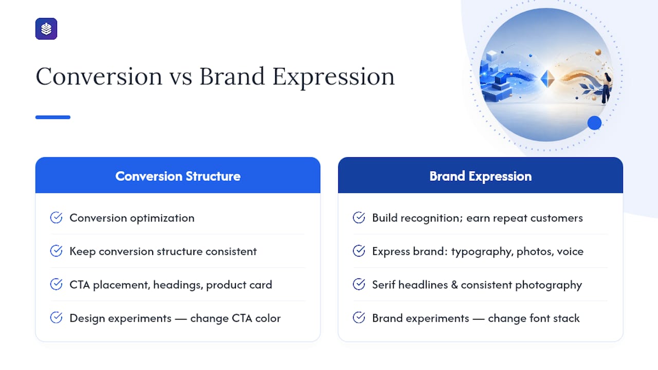
The practical resolution is simpler than most brands make it: keep your conversion structure consistent (CTA placement, heading hierarchy, product card position) and let your brand express itself through typography, photography style, and voice. Those three elements are where brand identity lives in a blog. A distinctive serif headline font, a consistent photography treatment (flat lay vs. lifestyle vs. editorial), and a recognizable editorial voice will differentiate your blog from every competitor running the same Dawn theme with the same blue buttons.
Where brands go wrong is treating design experiments as brand experiments. Changing your CTA color to test conversion is a design experiment. Changing your font stack to test brand perception is a brand experiment. Run them separately, measure them differently, and never sacrifice your conversion structure to make a brand statement.
The stores that win long-term are the ones that make their blog feel like a natural extension of their brand, not a generic content channel bolted onto a Shopify store.
Blockpress gives you design, SEO, and analytics in one Shopify editor
Putting this checklist into practice usually means juggling three or four separate tools: a blog editor, an SEO app, a schema plugin, and an analytics dashboard. Blockpress collapses all of that into a single editor that lives inside your Shopify admin.
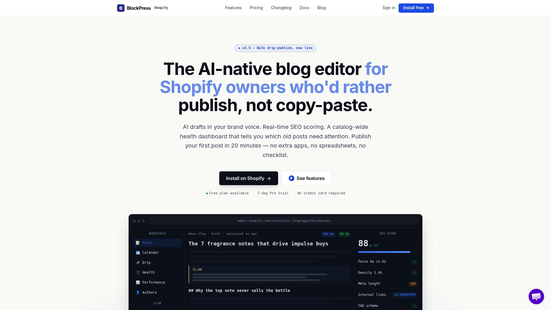
With Blockpress, you get live SEO and UX scoring as you write, so you catch missing meta fields and readability issues before you publish, not after. AI-generated drafts in your brand voice cut first-draft time significantly. Built-in product reference blocks let you embed product cards contextually without switching tabs. Author bio pages, article health audits, and per-article performance analytics are all native, so you can run the experiment framework from this guide without setting up a separate reporting stack. For stores running a consistent publishing cadence, bulk drip-publishing and a scheduled calendar mean you can plan a month of content in one session. See the full feature set and start a free plan directly through the Shopify App Store.
Sources
Use these references when implementing the guide's recommendations:
- Homepage Design: 18 Examples and Best Practices (2026) - Shopify
- Using Shopify Blog to win AI citations in 2026 — Surfient
- Best Shopify Blog Examples That Actually Drive Sales (2026)
- Shopify
FAQ
What makes a Shopify blog design effective for ecommerce?
An effective Shopify blog design matches your storefront's visual identity, uses a mobile-first layout with CTAs in the thumb zone, embeds contextual product cards, and includes Article schema with author and publisher objects. These elements together improve both conversion rate and search visibility.
How do I add schema markup to my Shopify blog posts?
Edit your article.liquid template to include a JSON-LD <script> block with Article, author (Person), publisher (Organization), datePublished, and dateModified fields. Validate the output with Google's Rich Results Test before publishing. The Shopify developer docs provide the canonical template reference.
Do I need a page-builder app to improve my Shopify blog layout?
Not necessarily. The native Shopify theme editor handles most layout changes for stores publishing fewer than five posts per month. Page-builder apps add value when you need a consistent template applied quickly across a high-volume publishing schedule, or when you want visual drag-and-drop control without editing Liquid.
How often should I publish to see SEO results from my Shopify blog?
Consistency matters more than frequency. Publishing two to four well-structured posts per month on a predictable schedule outperforms sporadic bursts of ten posts followed by silence. A content calendar helps maintain that cadence without overloading your team.
Which KPIs should I track for Shopify blog performance?
Start with add-to-cart rate from article links as your primary conversion metric. Track time on page, scroll depth, and internal-link click-throughs as secondary signals. Review each post at the 30-day mark to give traffic data time to stabilize before drawing conclusions.